***** Enrol now in the most comprehensive and up-to-date (Nov 2022) course available for the Data Analysis & Visualization in python Concepts! *****
About the Instructor.
This course is led by Aditya Dhandi – an international trainer, consultant, and data analyst with over 100 000 enrollments on Udemy. Aditya specializes in teaching data analysis techniques, Excel Pivot Tables, Power Pivot, Microsoft Power BI, & Google Data Studio & his courses average 4+ stars out of 5.
He’s also the founder of the popular website, Jobshie.
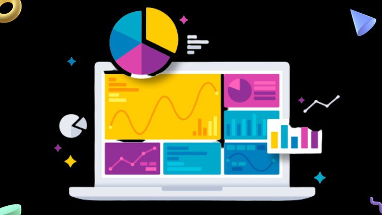
Why Learn Data Analysis & Visualization?
Data analysis is a process of inspecting, cleansing, transforming, and modeling data with the goal of discovering useful information, informing conclusions, and supporting decision-making.
Data analysis has multiple facets and approaches, encompassing diverse techniques under a variety of names, and is used in different business, science, and social science domains.
This course is a complete package for everyone wanting to pursue a career in data analysis.
This course gives you complete knowledge from basics to advanced level on Excel, Python, and SQL.
You will learn to create interactive dashboards using Excel as well as Looker.
Key Features:
Video Lectures: Learn the best ways to learn Data Analysis & Visualization
Course Certificate: Complete the course and show off your skills with the course certificate.
Learn from experts: Your expert instructor will teach you Data Analysis & Visualization skills you can apply immediately.
Full Excess: There is no time limit, so take the course at your own pace and retake lessons as you need.
Use any Device: Join the course using any modern browser on your phone, tablet and computer.
Ask Question: Ask questions and share ideas with other students in the course community.
No Comments
Leave Comment